
We start this special 'returning home,' edition of the blog with my grandparents 60th wedding anniversary. Needless to say it's a pretty impressive number, and having everyone down at dads site (http://www.topevents.gb.com) to try out the events. This is an extremely long blog, so let's move on.

This is one of my friends from from uni, with whom I ventured into a geek festival. It was pretty good fun, and there may well be a couple of pictures from the very same convention. Things like steampunk fashion shows, red dwarf appreciation, board and card games - a real smörgåsbord. Nineworlds, in case you are interested.

This is a cousin. We ate at great expense in a garden, nothing but cakes and family. It was interesting to see what everyone is up to nowadays, what with the years difference since last we met. Some are headed to Dubai, some to other parts of England. One to Japan.

I couldn't help including these two gems. They're funny because they are, the combination of lettuce and confusion (or is it annoyance?) coupled with the following memory of brussel sprouts (I can only assume that is the cause of the following expression).

To be fair, no one likes brussel sprouts.

I managed to head out to a couple of RSPB places with grandad. One a reserve (who has two thumbs and saw a pair of kingfishers (#)), the other an exhibition. I have mixed feelings about this picture, the combination of Grace smiling and grandad not is pretty jarring.

After the rain fell in Simons garden, these little flowers were covered in raindrops. Unfortunately I forgot that water is rather difficult to photograph on account of it being see-through; and therefore taking the colour of whatever is behind it. As such, you can't really see the water droplets. Take my word on the beauty of the droplets.

This is a hideously tacky coffee shaped plant pot mum bought. It really is that colour. Actually, if you modify your monitor so that it only shows red, and make that red the reddest red that can red a red, you'll approximate the actual colour.

This is the outdoor clock. As with the above image, I set the camera on a tripod, set it for 30 seconds on a relatively low ISO with a small aperture (about f8 I think) and shone a light on the parts I wanted to show up in the picture. As you can see, the brick on the right hand side is also lit up because the torch beam wasn't very focussed. If I were to do it again, I'd project the clock further from the wall, have a more focussed beam coming from the torch, and use a more sturdy tripod. With the weight of the camera and the very slight vibrations coming through from walking around, it's ended up being rather blurred. Either that or the focussing was pants (it's quite difficult to get the focussing right when you can't see anything). Another must would be a large floodlight for the very reason of initial focussing.

Using the same technique as above, I lit this lantern with the plants in the background. By their very nature, flowers tend to move around and as such, they were never really crisp. It's interesting because on the back of the camera this picture looked absolutely amazing. It left a bit to be desired when blown up to full, however.

I personally prefer the darker shot as above, but some people find this kind of lighter image more interesting. One thing I do like about this picture is the plant life on the right, just fractionally appearing in the shot before entirely disappearing. It hints at a block of light creating the scene, rather than the small torch that was actually used.
.jpg)
This is one of my favourite species of photogrpahy. Sitting a camera on a tripod and leaving it open while fast moving, lit objects fly past. In this case it was a car. The colour image is nice, but the vignetting coupled with the noise, give this black and white image a special interest in my eyes. Even without the red lines inherent in nighttime car photography, I feel this image works quite well. The contrast between the road and its dimples really strike me as appealing, what could be a dull surface (especially in black and white) has a texture that can be felt just by looking at it. The lines are well framed, drawing the eye all over the picture. That's probably what I love about black and white - a full quarter of the picture is absolute black, but that creates interest. Whereas a colour picture might contrast bright shades with the shadow, this uses shapes. An altogether separate phenomenon, and the reason (I think) why black and white survives despite the shinier, newer technology (unlike betamax).

This image is extremely rough. There is a photograph to be had somewhere, I just couldn't figure out quite where it lay. I didn't want to keep relying on black and white, so I ventured into colour while trying to emulate the interest some of the others piqued. The road still has that amazing texture, but nothing else really works. Honestly, I thought the hanging trees would frame the shot better than they did. Then again, nothing is in focus which detracts as well.

This is from the nineworlds convention, showcasing the bizarre world of steampunk. Their whole outlook is one of frivolity and rube-goldberg outlandishness.

This is one of exactly two photographs I am willing to share; the others are rather bland, out of focus or just plain boring. It's a shame because the event was anything but. I did learn a fair amount about simple aspects of photography - setting up the camera properly always helps for example.

This is another one of my mate. I can't remember what he was talking about, but it looks fairly serious. I think this picture could actually use a little more contrast. It's interesting because the current (common) train (wreck) of thought is that more contrast is absolutely the goal with all b/w photography. It basically results in every single picture looking like a charicature, or like the stereotypical 80 year old 50 a day smoking Puerto Rican. If you don't know what I mean, google that last sentence - I'm sure something will come up.

What does this cloud look like to you? I thought it looked like a plain old boring bird, but I recently spoke to someone who thought it looked like a much more romantic phoenix.

The fool from university again. Not all pictures have to be serious - I'm certainly not. It beats the typical snaps where people are giving the duck face. Again, google it.

This is the bird watching grandad. I thought I was fairly observant, having taken something of my dads ability to observe around an area, without ever actually looking. For example when driving, he notices everything but the road he's driving on. I'm sure it's dangerous, but he's never crashed with me in the car.

This formation flew overhead when we were talking to a lovely lady about all sorts of things. It was difficult to tell whether she was extremely friendly or on behaviour altering medication, but either way it was pleasant.

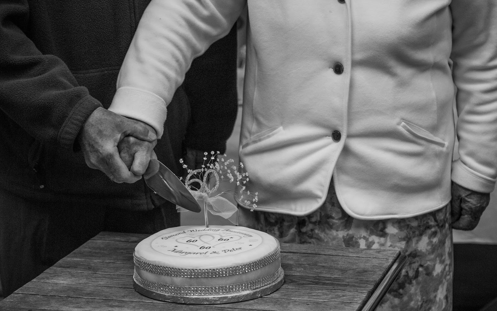
I messed this picture up. Only half of grandma is present. I was focussing too heavily on the cutting, which is the most interesting part of the picture (it's where grandma and grandad merge, so the eye tends to be drawn to the knife) but it looks kind of strange when your eye goes back up to the downturned faces. I don't mind they're looking away from the camera, but some people do find that off-putting.

This is one of my absolute favourite pictures from the trip. It would be absolutely perfect if the glasses were taken off, and once again, maybe a fraction more contrast. I might take it back to the editing suite and play around with it some more. That's THE great thing abotu digital as far as I'm concerned - not that you can take shots ad infinitum, but that you can edit ad nauseum. Cor, fake latin.

A cousin bouncing around, doing a passable impression of Cleese or Dr. House before he was House. I forget his name.

The problem I am having at the moment is that the kinds of photography I want to indulge in, require rather specialist lenses. I'd love to do street photography. People strongly recommend smaller Leicas and assorted rangefindery, but I don't have a spare 10 grand. With what I've done so far, a really fast 50mm (like the 1.2 50mm canon make) would seem to be perfect, even with a big body. That's still a grand. At least it's not ten.
The other stuff, like macro, I'm not particularly fussed about. The other end of the extreme, the ultra telephoto (400mm plus) is absolutely appealing to me. I adore the wildlife shots you can get with these lenses. I don't like the 5k pricetag much though.
The reason I bring this up at this point, is that the hoverfly is ridiculously small in this picture. Even with a simple 200mm lens, it would be appreciable.

This is a picture I was playing around with in photoshop. I spent five minutes mocking this up, not paying much attention to edges, with the intention of seeing whether the shot worked. I'm still not sold because I find myself being something more of a purist than I'd imagined. I'm not opposed to digitising and digital workflows, but I do find myself disliking the garishness of what flows out of the internet. This picture borders on the obscene for that reason. If I end up flip-flopping, I'll spend a while fixing the edges and making it presentable. I mean, I don't hate the picture...

If I cropped the blue out of this one I think it would work well. Maybe straighten the edges a bit. I really like the digitally altered contrast employed here (having just slagged off the high contrast kids of today). I quite enjoy the disproportionate use of pink too.

This one is exactly the opposite. This is washed out and dry feel of all the colours somehow suits the minute insect as it bumbles around.

I've always like the shots where someone is looking back at the camera while obviously walking forwards. It's compelling because you assume a connection with the person in the picture, a dialogue. It helps if there's a beauty in shot. Imagine just about any romance you've ever seen in a film where there is a dream sequence - the leading lady will always do this on screen. That kind of shot is always on the face, to give a romantic, close feeling to the sequence. This one is more of a jolly stroll through the woods.

There was an old burnt stump in the woods. Black and white lets the contrast do the talking, showing the texture quite successfully. I love the detail shown here.

The bark on this tree was also quite interesting, but keeping the colour means it's more difficult to emphasise the texture over the colour. The narrow focus helps keep the eyes on the bark, and as such, on the texture.

It turns out that my aunt is wearing camoflauge gear when converted to black and white. This is one of the many 'nearly,' shots I take, where everything seems to line up nicely, but one distraction makes the photo much less appealing. In this case, the lack of distinction between her shirt and the bush on the right. Annoying. I might take it back into colour and see how it looks.

I had someone holding my hand while I leaned over to take this picture. Butterflies never seem to rest, so to find one warming up in the sun, or chilling out in the shade is quite rare. As such, I put the lens into macro and leaned in over a ditch of nettles. I wasn't keen to go for a dip, so I had someone hold my hand while I leaned over the stingers. It's not exactly the most stable way to take a picture, so I took a few to make sure the odds of at least one being acceptable were improved.

A bit further along was this, a common butterfly around England, but one I don't know the name of. Again, if I had a full-time macro lens I might have filled a larger portion of the frame.

I quite like the frog peeking out from behind the leaves. The colours were surprisingly drab considering the green camo they sport. It doesn't really work for a number of reasons, chief among which is fully half of the picture is obscured by a bloody great big plant. Whoops.

This is an equivalent picture to the b/w one above. The goggles are extremely annoying, which is another positive when shooting black and white, because if a highlight is blown it usually adds to the contrast with another aspect of the picture. With colour photography, it just looks bad.
(#) with that joke, you have to imagine me standing there pointing my thumbs towards my chest, as if to say me, along with the... it's funnier in person.
No comments:
Post a Comment